
WPF Controls : Design-Time Integration
One of the things that affects the overall friendliness of your custom WPF controls - but you may not consider implementing it - is the design-time integration. With Cider continuing to exist in VS 2010, there’s a lot of design-time functionality at your disposal. Since the model is different in Cider than creating designers for WinForm controls, I’m trying to shed some light on the subject. To demonstrate this, I’ll show some simple steps on adding design-time capabilities to my FarsiLibrary controls which are a pack of date related controls (DatePickers, MonthView, etc.) freely available here. This is not meant to be a complete guide but will let you build a basic designer if you need to.
In order for your designer to get loaded by the design-time host, it is essential that you name like YourProjectName.VisualStudio.Design. Guess this is to force developers move out their design-time logic out of main control’s dll (as was encouraged in WinForms).
Preparing MetaData
First thing you should do, is to plug into meta-data registration mechanism. We do this by creating any class and implementing IRegisterMetadata interface. Then we need to create our various attributes on a Attribute Table. Here’s how you might do it:
1 | public class VisualStudioMetadata : IRegisterMetadata |
In order to get this metadata loaded, you need to have the assembly containing this interface beside your Controls assembly and it will eventually gets loaded when needed. Also when updating the design-time assembly, VS.NET unloads the old one and uses the updated assembly. This will bring you a lot of performance gain and ease when creating designers for your controls because you no longer need to exit the current instance of VS.NET and run a new one to get the changes loaded.
In fact, unlike WinForm model where design attributes were added to the actual control’s source code, in VS.NET 2008 (and later?) the new model allows you to switch designer assemblies at a later stage or even create a designer for a control you don’t have access to the source code.
Toolbox Integration
WPF controls are usually consisted of various primitive type controls, like shapes, buttons, labels, content controls, etc. These parts are composed to build the actual Control. When the final control’s assembly is loaded in design-time environment, (e.g. VS.NET), control parts will be added to the toolbox but this may not be appropriate since you don’t want your control’s building blocks to appear on the toolbox. However, contols will disappear if a proper toolbox attribute is to them.
1 | internal class FarsiLibraryVisualStudioAttributeTableBuilder : AttributeTableBuilder |
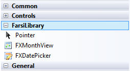
This will result your controls not being visible when the toolbox is loaded. In case you to show your custom icons appear in the toolbox you should create a BMP icon and place it on your main control’s assembly (not design-time assembly), and give it a proper name. The name should be YourControl.Icon.bmp and you should set the bitmap’s action to “Embedded Resource”.
Property Grid Integration
You can specify where and how the control’s property will be shown in PropertyGrid of VS.NET when the control is opened in the design-mode.
To hide properties similar to BrowsableAttribute in WinForms you can use the following snippet:
1 | builder.AddCustomAttributes(FXMonthView.ButtonStyleProperty, BrowsableAttribute.No); |
and to specify the category of the Control’s property similar to CategoryAttribute in WinForms:
1 | var behaviorCategory = new CategoryAttribute("Behavior"); |
Some attributes still work in WPF world. For example you can use the EditorBrowsableAtribute on your properties to make them show in Advanced section of the new WPF Property Grid. The usage is the same as before:
1 | [] |
Visual Studio WPF Designer supports the full extensibility framework, but Expression Blend only supports property editors, metadata loading, and licensing. and it does not support menu actions and adorners.

Menu Actions
Another way to change your control’s design-time behavior is to add actions to VS.NET Context-menu which will appear when the control is right-clicked upon. Unlike WinForm’s Designer Verbs which also appeared on the bottom of the Property Grid, these menu actions will only appear when the control is selected on the design surface.
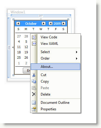
You can add your menu actions by extending PrimarySelectionContextMenuProvider class and load it with your IRegisterMetadata instance:
1 | private void AddMonthViewMenuItems() |
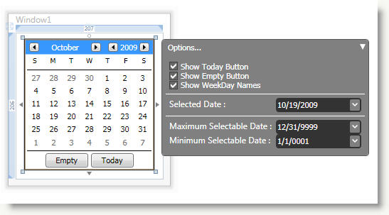
Design-Time Adorners
To have more control on how users interact with your custom control and to provide them an elaborated experience, you can benefit control adorners to create a more robust design-time functionality. You can create WPF UserControls that manipulate your control in a developer friendly way. You can create a Design-Time Control Adorner by extending PrimarySelectionAdornerProvider class which resides in Microsoft.Windows.Design.Extensibility assembly. Just a couple of methods to override and you’re all set here. Here’s the method’s skeleton to show you what is the general idea:
1 | public class MonthViewDesignAdorner : PrimarySelectionAdornerProvider |
To synchronize the values between our Designer and Control, the designer should implement INotifyPropertyChanged interface to report back when a property value is change in design-time and we set property on the control accordingly. Control’s properties are accessible via our ModelItem instance which is set in OnActivate method. For example to access a dependency property on our control and set it’s value we need to do the following:
1 | ModelProperty prop = calendarModelItem.Properties["SelectedDateTime"]; |
As for our designer goes, you can create a WPF user interface, a WinForm dialog or even both (through WPF and WinForm Integration mechanism). Here, I’ve created a UserControl to act as my designer and added some simple controls to edit the properties of my actual controls. To handle editing of SelectedDateTime property (which is of nullable DateTime type), I have used another instance of my FXDatePicker on the design surface (the design-time control’s are skinned). Here’s the designer’s XAML:
1 | <UserControl x:Class="FarsiLibrary.WPF.VisualStudio.Design.MonthViewDesignerUI" |
Basically, when a property is changed on our designer, we’ll raise the INotifyPropertyChanged event with the newly changed value and matching property name on the control that should be changed. You could directly bind your designer’s control to the actual control’s properties and it would work but this gives you more control. The code-behind looks very simple:
1 | /// <summary> |
Now, PropertyChangedEventArgs sent by INotifyPropertyChanged does not send the actual value (though you can read it through the sender). To easily read the changed value I’m using an extension to PropertyChangedEventArgs named DesignerPropertyChangedEventArgs (works just like PropertyChangedEventArgs but also has the value inside). With this, our synchronization code looks like this:
1 | private void OnDesignerUIPropertyChanged(object sender, PropertyChangedEventArgs e) |
Conclusion
Designer integration with seems way better than WinForm world and with WPF powers you can create very sophisticated designers. The only drawback is that Cider and Expression Blend designers are different, both in how they work and what functionality they provide so you might need to create separate design assemblies one for each environment which is an unnecessary burden to me. This is just a scratch in the surface of what you can achieve by creating custom designers for WPF Controls.
